At the end of October, Google released a new UI for their “Compose” and “Reply” functions in Gmail. After using it myself, I’m happy to say:
“Well done Google. Well done.”
A few things have taken some getting used to, but after using it for a while, I’ve started to feel right at home with the “completely redesigned compose and reply experience”. So here is the nitty gritty on the compose side of things:
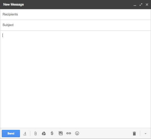
- Compose now pops up in its own window, like a giant chat box
- Re-structuring of text editing buttons
- New design of To, CC, and BCC boxes and how they function
- Automatically saves drafts as you write
All of this was announced by Phil Sharp, project manager at Google, in this lovely blog article (first time I’ve ever seen this blog actually). The article also showed up in my inbox.
The biggest thing I noticed was how they went about achieving the following: “The new compose is designed to let you focus on what’s important: your message.”
First, they simplified the compose box. The CC and BCC dissappeear when the cursor moves outside the “To:” field. I find this to be a very nice way of helping me “move on” to write the message by giving me less to look at of what I’ve already finished – i.e.- deciding who my message is for.
Second, the text editing boxes are much more simplistic and folded under one little icon:
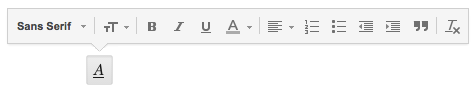 I initially didn’t like this change because I have to reprogram my mind about the meaning of certain icons such as the “text color” icon and the “align” icon, but overall, these are good changes. It may take some time to get used to, but it shouldn’t be too hard and it makes for a better design. A few things to note about text editing:
- Editing is out of the way when you are writing. Gives all focus to message when not editing.
- The “text color” symbol (underlined “A”) allows you to edit both the text color and the background color. I’ll get used to this, but I’ll have to retrain myself to remember that symbol now stands for two things instead of one.
- “Align” icon leads to align, indent, and block quote functions. (I wish WordPress would do this)
- Clear “attachment” and “insert” buttons (Attach files, Insert files using Drive, Insert Photo, Insert link, Insert emoticon)
![]()
A few . . . not so awesome things:
- Google says that “The writing pane grows as your message gets longer.” I tried this out and it gives me, what, 2 extra lines of space? Whoop-de-doo.
- Was my message even sent? I used to see a “message sent” notification when I send a message, but that is gone now. It leaves me wondering if I clicked the “X” and now its in my drafts, or if my internet cut out or something and the message never left. I personally think that notification is needed.
- The stacking of compose messages from right to left is not intuitive to me (when composing multiple messages at one time). My mind seems to want the newest message to be on the far left instead of the far right. Top to bottom, left to right is intuitive to me, and the way Gmail stacks these windows is the opposite.
- While the new compose is “designed to let you focus on what’s important: your message”, I think they need one additional change to help with this, big time. When composing a message, the inbox is a distraction. While writing, I can still see words, words, words, clutter, clutter, clutter. Allowing me to always see the inbox causes me to think about other messages, and notice other things. These “other things” draw attention away from my new message. Solution? = have the inbox fade out until I move my mouse outside the compose box. Like a lightbox. It should also briefly light it back up when a new message arrives, then fade out again. This would allow me to still see my inbox and refer to old messages, but when writing, I can better focus on the writing.
- Text format icons need a tiny splash of color. What is with all this boring gray that Apple and now Gmail are introducing into their UI? Some gray is good, but too much is not. I personally think there is too much gray in the text format box. Add a little color please, it takes extra time to register when it is all gray.
So all in all, I really like the new design for “Compose” in Gmail. Well done. And I think with a few additional improvements, it’ll be “just right“.